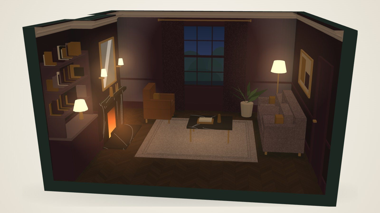
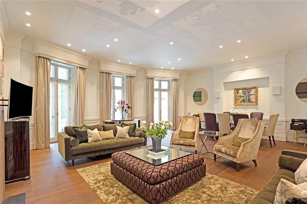
29 colours and their partners: a guide for London homes
· 8 min read
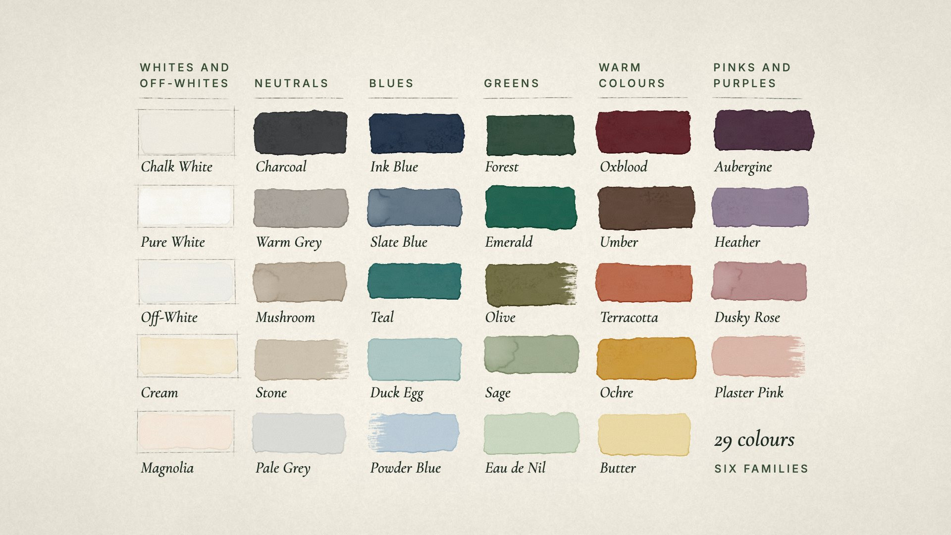
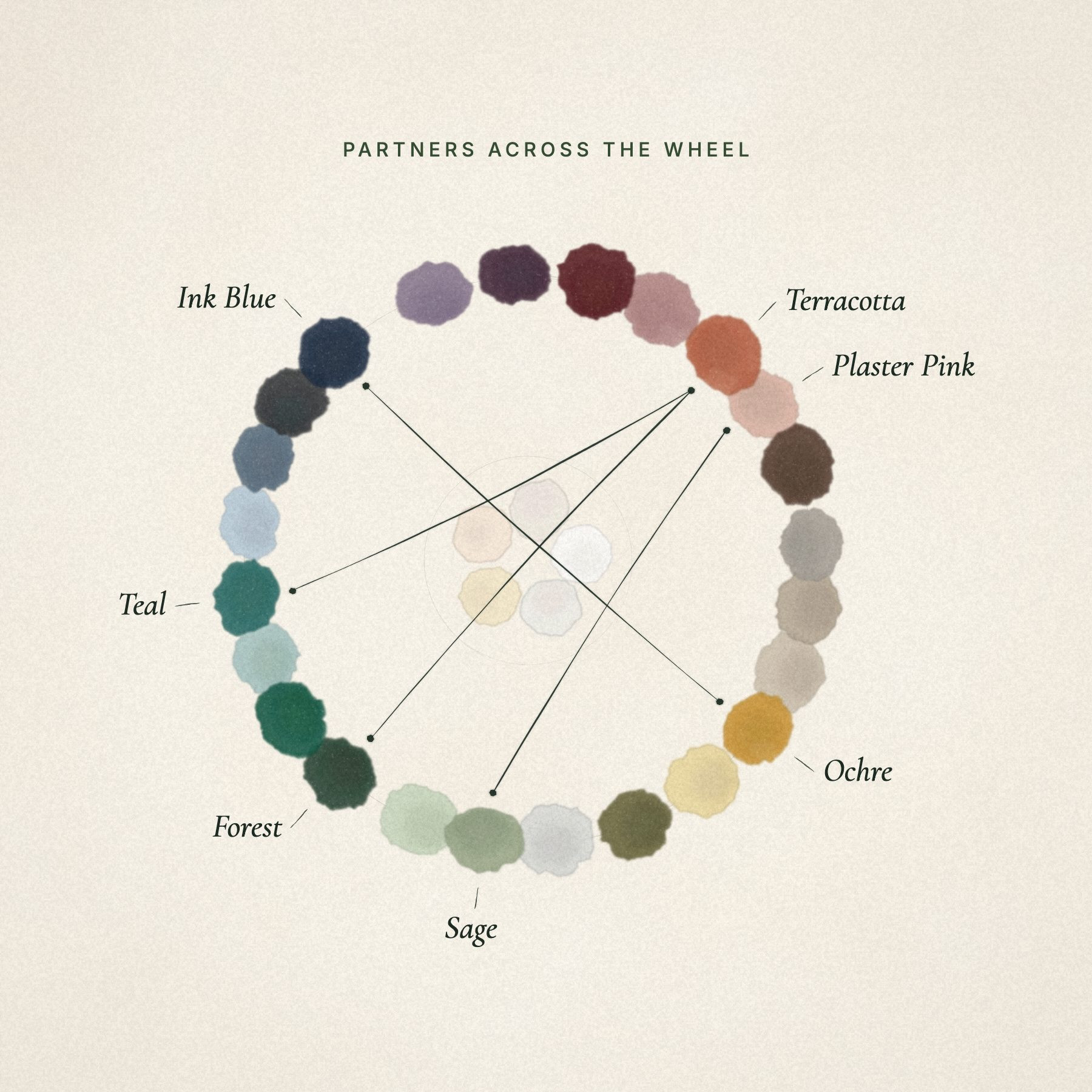
Every good colour has a partner that makes it look its best. Sometimes it sits opposite on the colour wheel, like blue and ochre, and sometimes it is a pairing proven in period houses for two centuries, like deep green and terracotta. Get the pair right and a room feels considered rather than decorated.
Here are the twenty-nine colours in the Colour Room, from the everyday whites to deep greens and plums, each with its first partner, two more that work, and the floor and metal that suit it. You can dress a room in any of them, with any of its partners, and see it in morning or evening light, in the Colour Room.
How to use a partner colour
A partner works best in small, deliberate doses. A simple rule designers use is 60, 30, 10:
- About 60% of what you see is the main colour: walls, and often the woodwork.
- About 30% is a supporting tone: the floor, a large sofa or rug, often a natural material.
- About 10% is the partner: curtains, cushions, one chair, a lampshade.
The partner makes the main colour look richer. Used everywhere, it simply competes with it.

Whites and off-whites
- Chalk White with Charcoal: charcoal and black metal give a white room its outline, crisp and timeless. Ink blue or forest green on the woodwork do the same with more colour. Honey oak and linen keep it from feeling clinical.
- Pure White with Charcoal: the brightest white, and the classic for woodwork and ceilings, given its outline by charcoal. Ink blue makes it the freshest classic, like blue and white china, and sage brings the garden in. Honey oak, white marble and nickel suit it.
- Off-White with Slate Blue: a soft white with the chill taken off, the easiest white to live with, given a calm, tailored edge by slate blue. Forest green grounds it, and terracotta warms it without weighing it down. Honey oak and aged brass suit it.
- Cream with Forest: a warm, buttery cream, and with forest green a classic country house pairing. Ink blue gives it a crisp outline, and oxblood makes it rich by lamplight. Honey oak, Portland stone and brass suit it.
- Magnolia with Sage: the soft, creamy white with a blush of pink, freshened by sage. Slate blue gives it a calm, modern edge, and mushroom deepens it gently. Honey oak and aged brass keep it warm.

Neutrals
- Pale Grey with Ink Blue: a light, cool grey, deepened by ink blue into a smart, restful pairing. Ochre warms it at once, and plaster pink makes it soft and contemporary. Limed oak and nickel keep it light.
- Stone with Ink Blue: a soft, sandy neutral, given a crisp, classic outline by ink blue. Forest green grounds it, and terracotta warms it. Honey oak, Portland stone and bronze suit it.
- Mushroom with Deep Navy: navy sharpens a soft taupe. Oxblood makes it richer, sage gentler. Smoked oak, bronze and Portland stone suit its earthiness.
- Warm Grey with Terracotta: grey goes well with orange, blue and green, and terracotta warms it at once. Ink blue gives it structure, deep green makes it feel rooted. Smoked oak and black metal add the definition greys need.
- Charcoal with Rust: a warm, modern pairing, the rust glowing against dark walls. Duck egg and sage soften it. White marble, honey oak and brass give it light.
Blues
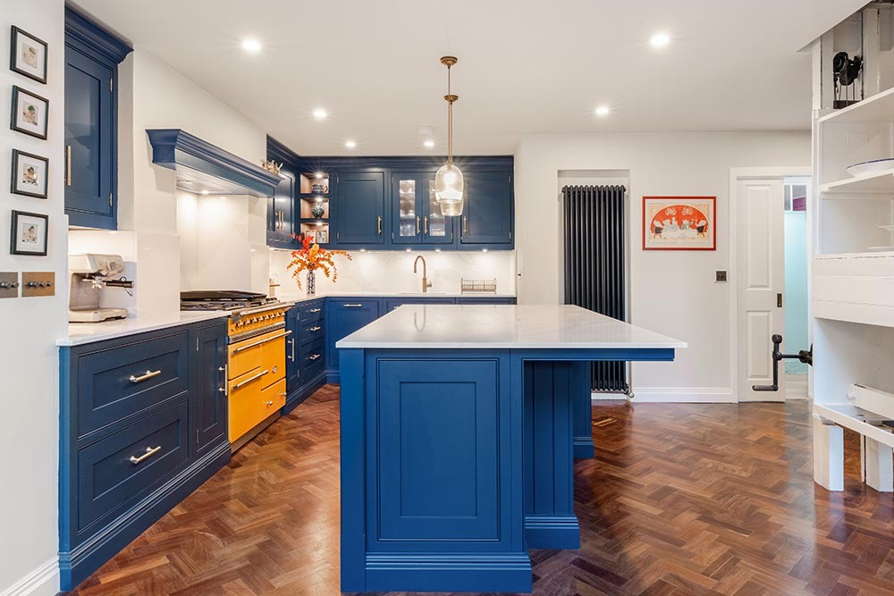
- Ink Blue with Ochre: blue and ochre sit opposite each other on the colour wheel, so a little ochre makes the blue look richer. Terracotta and plaster pink work too. Honey oak, white marble and brass keep a blue room warm.
- Slate Blue with Ochre: a soft grey blue, made deeper and warmer by a little ochre, while the blue keeps the ochre calm. Rust gives it a relaxed, lived-in feel, and plaster pink a gentle, modern one. Honey oak and aged brass keep it warm.
- Teal with Terracotta: opposites on the colour wheel, so each makes the other glow. Ochre makes it a confident, jewel-like pairing, and plaster pink softens it. Smoked oak, black marble and brass keep it grounded.
- Duck Egg with Rust: a little rust warms a cool, pale blue green. Ochre and plaster pink suit it as well. Limed oak, white marble and nickel keep it light.
- Powder Blue with Ink Blue: a pale, airy blue given depth by ink blue, a crisp classic like blue and white china. Terracotta makes it sunny and Mediterranean, and ochre adds a little gold. Limed oak, white marble and nickel keep it airy.
Greens
- Forest with Terracotta: opposites again, and a long-proven period pairing. Plaster pink and ochre are lovely with it too. Smoked oak, black marble and brass make it feel like a library.
- Emerald with Plaster Pink: a rich jewel green, softened by plaster pink into a glamorous, classic pairing. Ochre makes it a jewel box, and charcoal gives it a sleek, modern outline. Walnut, black marble and brass make it glow.
- Olive with Rust: autumn colours that belong together, warm and grounded. Plaster pink lifts the olive, and ink blue gives it depth. Honey oak, Portland stone and aged brass suit its relaxed, country feel.
- Sage with Plaster Pink: the pink warms the sage, and the sage stops the pink turning sweet. Ochre gives it an Arts and Crafts feel, ink blue a quieter one. Limed oak and aged brass suit it.
- Eau de Nil with Plaster Pink: a pale, silvery green and a period favourite, with its soft period partner. Forest green deepens it, and a little ochre warms it, like sunlight on leaves. Limed oak, white marble and brass keep it light.
Warm colours
- Oxblood with Sage: a soft opposite that calms a deep red and stops the room feeling heavy. Ochre and duck egg work too. Walnut and brass suit oxblood well.
- Umber with Duck Egg: a deep chocolate brown, lifted by duck egg blue in a classic, elegant pairing. Plaster pink softens it, and ochre glows against it like gold on leather. Honey oak, Portland stone and brass bring it light.
- Terracotta with Teal: teal sits opposite terracotta on the colour wheel, so a teal chair and curtains make the clay tones sing. Ink blue and sage suit it too. Honey oak, Portland stone and bronze keep it grounded.
- Ochre with Ink Blue: the ink blue pairing the other way round, and just as good: each makes the other look deeper. Forest green and charcoal work too. Smoked oak and black metal stop it feeling too bright.
- Butter with Ink Blue: a soft, pale yellow given a crisp outline by ink blue, like blue and yellow china. Sage makes it fresh and gentle, and charcoal smart and graphic. Honey oak and brass suit it, and it stays sunny on grey days.

Pinks and purples
- Aubergine with Ochre: a deep plum, rich and theatrical with ochre. Sage softens it in an unexpected way, and plaster pink makes it warm and tonal. Walnut, black marble and brass suit a room made for evenings.
- Heather with Sage: a soft, muted purple, and with sage a pair of countryside colours that sit easily together. Ochre sits opposite it on the colour wheel and makes it glow, and charcoal gives it a quiet, modern structure. Limed oak and nickel keep it light.
- Dusky Rose with Forest: a grown-up pink with a little grey in it, given depth by forest green, the classic pairing of pink and green. Charcoal sharpens it, and ochre warms it. Honey oak and aged brass suit it.
- Plaster Pink with Forest: deep green gives a soft pink backbone. Ink blue and sage work too. Limed oak, white marble and brass keep it airy.
Three ways to use the same colour
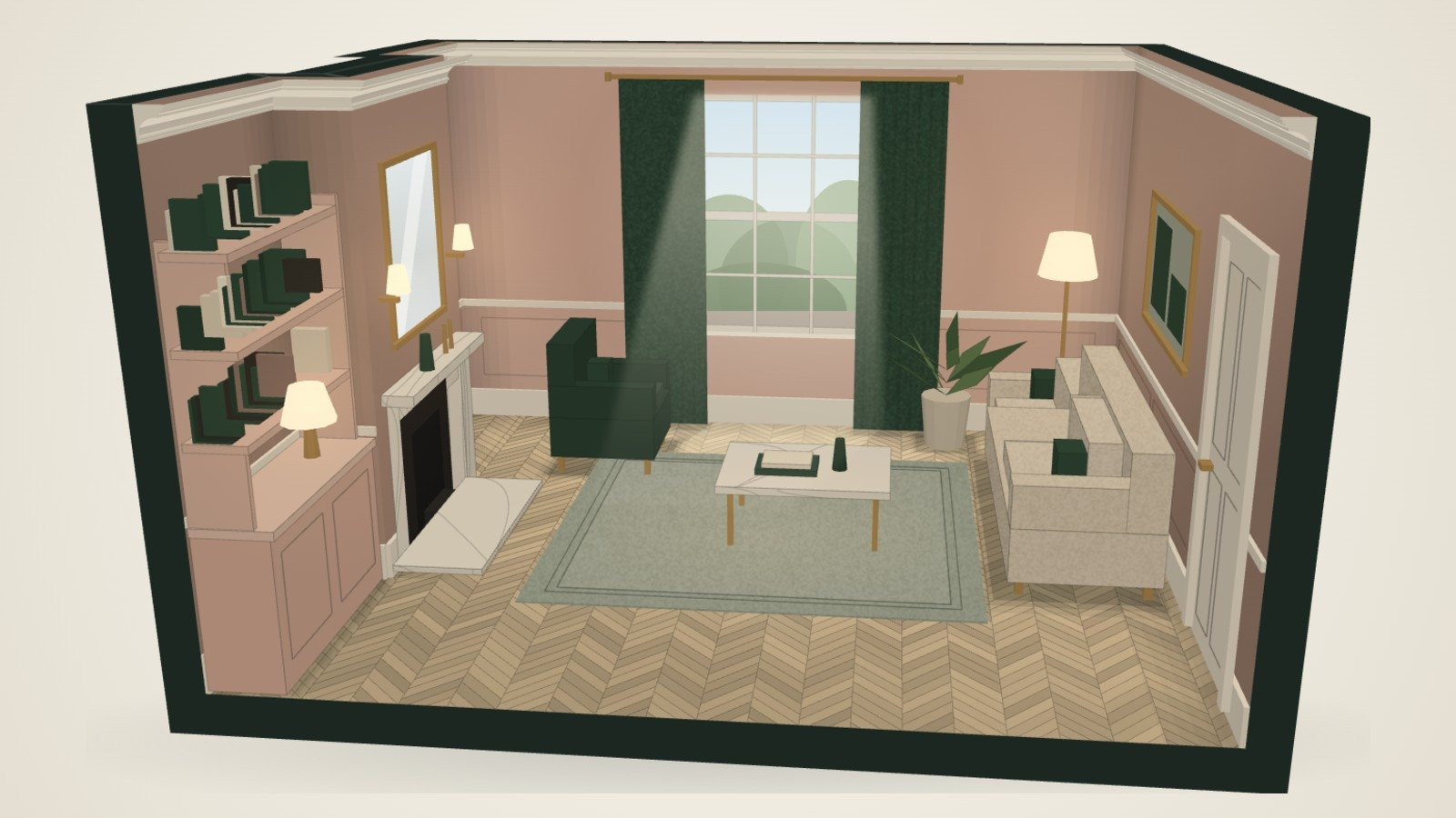
Every colour above can dress a room in three ways, and the Colour Room shows all three:
- Tonal: the colour on the walls and the woodwork, with deeper and paler versions of it around the room. Calm and enveloping.
- Contrast: the colour on the walls, white woodwork, and the partner you choose on the curtains, one chair and the cushions. With one of the whites on the walls, the partner goes on the woodwork and the joinery too.
- Calm: a warm or soft white room, with the colour kept to the sofa, the cushions and the joinery. The easiest to live with, and to change later.
At Ellerby Street in Fulham, the clients chose a darker, more contemporary look throughout, and the lighting was designed with it from the start. Our guides to lighting a living room and to period home interiors cover how colour and light work together.
Before you choose
Colours on a screen, or on a small card, are only a guide. Before you commit:
- Paint large samples, at least A4 size, on two walls.
- Look at them in the morning and the evening, in daylight and lamplight.
- Check them next to the floor, the fabrics and the metal you plan to use, not on their own.
The light matters as much as the paint: our guide to north and south facing rooms explains why.
If you would like help putting a scheme together, our interior design team matches every colour to your own light and chooses the paints, fabrics and finishes with you.
Good to know
Frequently asked questions
- What colour goes with sage green?
- Plaster pink is a natural partner: it warms the sage, and the sage keeps the pink from turning sweet. Ochre and ink blue work too. Limed oak, white marble and aged brass suit a sage room, and warm white or linen keep it light.
- What colour goes with navy or ink blue?
- Ochre: it sits opposite blue on the colour wheel, so a little makes the blue look richer. Terracotta and plaster pink work well too. Warm oak and brass stop a blue room feeling cold.
- What colour goes with dark green?
- Terracotta, a long-proven pairing in period houses, with brass to tie them together. Plaster pink and ochre suit it too. Smoked oak and black marble give a deep green room the feel of a library.
- What colour goes with grey?
- Orange, blue and green all work. Terracotta warms a grey room at once, ink blue gives it structure and deep green makes it feel rooted. Smoked oak and black metal add the definition greys need.
- How much of a partner colour should I use?
- About a tenth of what you see: curtains, cushions, one chair or a lampshade. The main colour carries the room; the partner makes it look its best.
- Should I choose white or off-white?
- Pure white is the crispest, and the classic for woodwork and ceilings. On walls, many people find an off-white easier to live with: it has the chill taken off, so it looks soft rather than stark, particularly in a north facing room. Warmer whites such as chalk white, cream and magnolia sit beautifully with honey oak and brass.
- What colours go with magnolia or cream?
- Sage freshens magnolia, slate blue gives it a calm, modern edge, and mushroom deepens it gently. Cream is a classic with forest green, crisp with ink blue and rich with oxblood. Honey oak suits both.
- Can I see these combinations in a room?
- Yes. The Colour Room dresses a London reception room, set to your own measurements, in any of these twenty-nine colours, with any of its partners, in three schemes, in north or south light, morning or evening, and gives you a mood board, a plan and a kit to keep.